簡介Introduction
Vitra設計博物館的概念,可以追溯到1980年代早期。當時,這間知名家具公司的總裁Rolf Fehlbaum,開始蒐集對該公司發展影響深遠的設計師家具作品,藉此紀錄該公司的發展史。Fehlbaum的收藏隨著時間愈形增長,也就開始有了展示收藏的想法。
The idea of Vitra Design Museum dates back to the early 1980s. It’s the period when Vitra CEO Rolf Fehlbaum started to collect designer furnitures which have had great influences on the company, as an attempt to document the history of the company. As the collection of Fehlbaum grew, so did the desire to exhibit the artworks that he’s collected.
 1986年,Fehlbaum有了創辦設計博物館的想法,並於隔年與Frank O’Gehry進行接觸,邀請這位知名建築師來設計博物館。之後,Fehlbaum更與Alexander von Vegesack一起,將原本私人收藏展示的概念,發展成為一間對外開放的博物館。
In 1986, Fehlbaum had the idea to extablish a design museum. He contacted Frank O’Gehry the next year and invited O’Gehry to plan the museum building. Later, along with Alexander von Vegesack, Fehlbaum further developed the idea of closed private collection into a museum that is open to the public.
博物館於1989年11月3日正式對外開放,成為全球設計研究與推廣的主要文化機構之一。館內的展示以家具和室內設計為重心,延伸到廣義設計與文化的層面,其活動重點包含展示、研習營、出版、收藏、檔案與專題圖書館,此外,該館超過十組以上的巡迴展示,足跡更遍及世界。
The museum was open to the public in November 3, 1989, and has become one of the major cultural institutions in the research and advocation of design. The exhibitions are arranged with the focus on furniture and interior design, but also extended to cover a broader perspective of design and culture. The museum’s activities include exhibitions, workshops, publication, collection, archive maintainence and a research library. Besides, there’re more than ten traveling exhibitions covering various themes circling to partner institutions around the world.
Joe Colombo
此番博物館行的重點在於參觀園區與博物館展示。該館展示皆為特展,每半年至一年就有新作。園區參觀包括幾位大師建築的作品與該館的百件椅子收藏,這些都必須額外付費參加專人導覽,才能夠一飽眼福。
The focuses of my visit were the site tour and museum exhibition. All exhibitions in this museum are temporary exhibitions and change every half year or one year. The site tour includes visiting buildings of famous architects and the 100 chairs collection of the museum, and can only be seen with paid guided tour.
目前的展覽以「Joe Colombo – Inventing the Future」為題,自今年一月開展,為期九個月,是該館與米蘭三年展會館及喬可隆波工作室合作的特展。
The current exhibition is “Joe Colombo – Inventing the Future”. It started from January 2006 and lasts until September 2006. It’s a joint project with Triennale di Milano and Studio Joe Colombo.
可隆波是位非常有趣的藝術家,有著許多聞名於世的設計作品,這個特展讓我驚奇地了解到他的貢獻,更讓我有天妒英才之憾(可隆波於1971年歿世,享年四十一歲)。展覽共分四個區域:在位於一樓的三個展區中,第一區用來呈現可隆波的生平、設計稿與重要作品,第二區展出他所設計的燈飾,第三區則擴展至家具與用品,而位於二樓的第四展區,則呈現出好似007電影一般的迷你公寓組。展覽除了呈現出六零年代的精神以外,更因為作品的功能性與形態而令人感到驚艷。
Colombo is a very interesting artist. He has designed many famous and long-lasting piece and the exhibition itself provided me with an idea as to his contribution. When I learned that he died at a very young age in 1971 (41 years old), I was feeling extremely sorry. The exhibition is divided into four areas, with three areas at the ground floor and the forth at the first floor. The first area presents Colombo’s life, his drawings and representative works. The second area is dedicated to his lamp designs. In the third area the objects range from furnitures to kitchen wear. And the forth area is used to display the mini-apartments which remind me the 007 movies. The exhibition not only shows the spirit of the 60s but also impress with the functionality and forms of the artworks.
此特展展出許多可隆波的珍貴草稿、素描、模型、影片等,因為我參加了十二點開始的導覽,不得不把看展的時間拆成兩半,因此大致上花了兩個多小時才把這個展看完。
There’re many precious original drawings, design rough, models and films on display. For the reason that I signed up to the site tour of 12PM, I had to break my visit into two parts and eventually spent more than two hours to complete the exhibition.
建築精華Architecture Highlights
園區參觀的重點有二,一是建築,另一則是椅子收藏。
There’re two focuses of the site tour. One is the architecture and the other is the chair collection.
世界上大概很難找到第二個地方,在不甚大的園區,卻有密度如此高的大師級建築作品。Frank O’Gehry、安藤忠雄、Zaha Hadid,、Nicholas Grimshaw與Alvaro Siza等人的名字,在建築界都是大師級的人物。這樣的集結呈現出一種很奇妙的氛圍,走一趟Vitra園區,就好像參觀了當代建築展一般,也正因為如此,在過去十五年來,此地簡直成了建築愛好者的朝聖之地,而館方的專人導覽,也正是為了因應前來朝聖的人群所衍生而出的服務。
It’s probably difficult to find a second place with so many buildings designed by master architects in such a compact area. Works of Frank O’Gehry, Tadao Ando, Zaha Hadid, Nicholas Grimshaw and Alvaro Siza can be seen here. The congregation presents a peculiar atmophere. Going to Vitra site is like visiting an exhibition of comtemporary architecture. For this very reason, it has become a Mecca for architecture lovers in the past 15 years. The guided architecture tour is actually a service provided by the museum in response of the needs of the people who come for the pilgrimage.
導覽的起點,是O’Ghery於1989年完成的博物館建築。這件如雕塑般且富於表現的作品,事實上也是O’Ghery在歐洲完成的第一件作品。隨著導覽人員的腳步,我們走過Buckminster Fuller設計的巨蛋型結構、Jean Prouv?的小型加油站、Alvaro Siza的廠房、最後來到了Zaha Hadid為Vitra公司所設計的消防站。
The starting point of the guided tour is the museum building by Frank O’Ghery, completed in 1989. This sculpture-like building is rich in expressiveness, and is actually the very first work of the architect in Europe. Following the docent, we passed by the dome shape structure designed by Buckminster Fuller, the small-scale petrol station by Jean Prouv?, the production hall by Alvaro Siza, and finally reached the fire station by Zaha Hadid.
 除了博物館以外,因為參加導覽的關係,才得以進入Hadid和安藤替Vitra蓋的兩棟建築。這是我第一次體驗這兩位建築師的作品,其實是蠻新奇的經驗。Hadid的建築很有解構的味道,靈活的線條運用,規劃出很不一樣的外觀與空間。她利用線條創造出視覺上的錯亂,身歷其境的空間感,比實際空間大了許多、長了許多。另一方面,她更利用線條製造出流動感,即使站著不動,我還是不斷地覺得自己的身體左右晃動。
Apart from the museum building, I was able to enter the buildings designed by Hadid and Ando due to the guided tour. It’s the very first time that I saw works from these two architects. It’s quite an interesting experience. Hadid’s work brings me a sense of deconstruction. She made use of lines and shapes at ease to create a very different appearance and space. She created certain level of visual confusion that the space one can feel when s/he is personally in the building is much broader and longer than the actual space. On the other hand, she also created a kind of fluidness that even I tried to stay still I still felt myself shaking constantly.
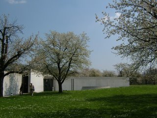
 安藤的作品,則是另一種完全不一樣的感覺。在會議中心裡,有一種沉穩和諧的感受。導覽人員解釋著,構成水泥牆的單位與符合黃金比的榻榻米等大,往落地窗外看過去,會在外牆上看到一條代表著水平面的線,環繞著整棟建築物,以及特別光滑的牆面等,這些安藤所要求的細節,都是為了帶給使用者舒適感。看著窗外盛開的櫻花,竟然讓我感覺到一絲絲日本氣息。
Ando’s work brought me another kind of feeling, totally different from that of Hadid’s. The conference pavilion is calm and harmonious. According to the docent, the concrete wall is built of units equal to the size of tatami and the size of the unit is of the golden ratio. Looking outside the window, one can see a line on the outer wall circling the whole building. The line represents the ground level. The concrete wall is extremely smooth. All these details that Ando requested contribute to the comforting feeling of its users. Surprisingly, looking at the cherry blossoms outside the window, I seemed to feel as if I was in Japan.
to be continued...

3 comments:
看起來很棒,
一個充滿大師作品的園區,
我也開始心動了....
Hi Thelma,
I don't think I've ever been to an architechtural museum before... maybe I should go. I sounds interesting.
I like what you are writing in this blog - it is an inspiration.
Love Karin
Post a Comment